Light family
Paper white and pale color.
Open sky, selected car shapes, bicycle glints, and small sunlit areas keep air moving through the painting.
Beginner lesson · Values into color
A value study helps me organize the painting before color adds more choices. I do not copy every mark. I carry the large light, middle, and dark families into color so the finished painting remains clear and three-dimensional.
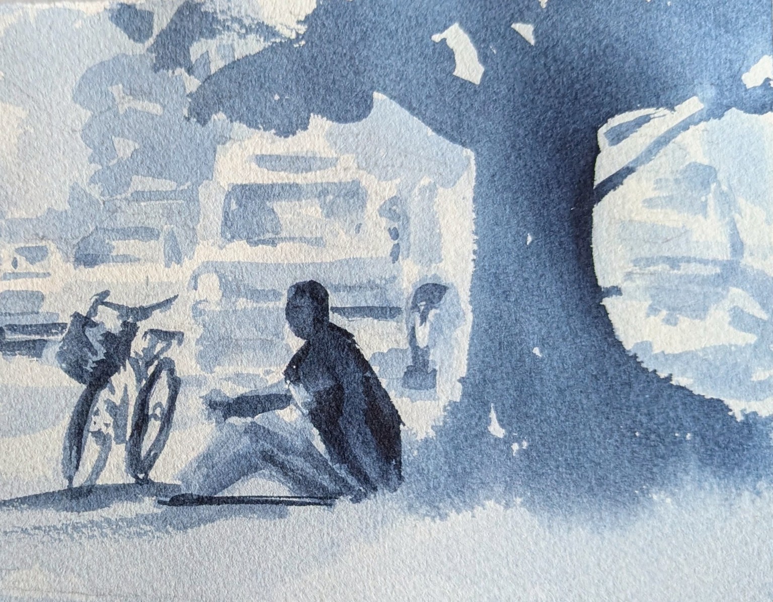
White paper, one broad middle family, and a connected dark family establish the design.
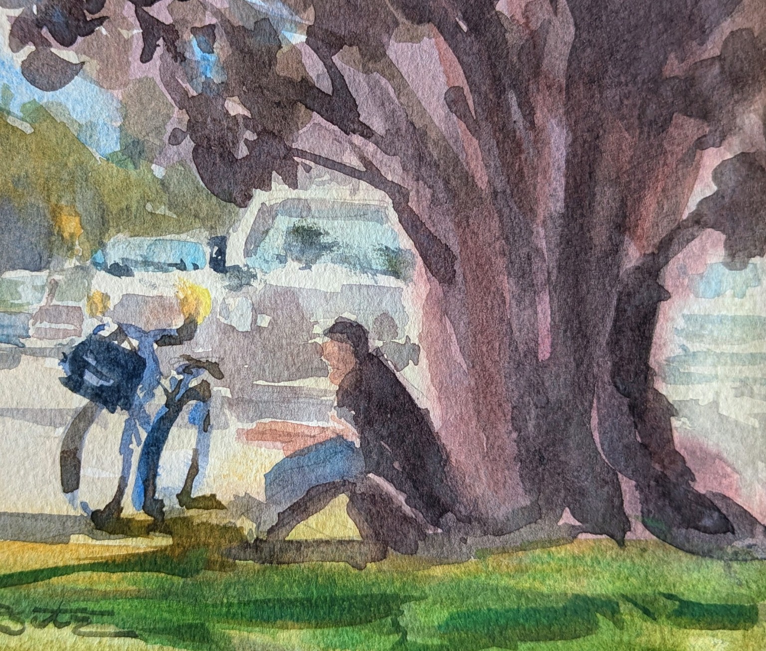
The pigments change, but the large value relationships continue doing the same jobs.
The common mistake
My reminder
“The colors can change, but their value families must stay the same.”
I avoid painting a green tree, blue car, or red shirt as separate objects. Instead, I ask whether each mixture belongs to the light, middle, or dark family.
Translate value into color
Value tells me how light or dark a mixture is. Hue tells me whether it is blue, red, yellow, or another color. I can vary the hue freely as long as I protect the larger value pattern.
Light family
Open sky, selected car shapes, bicycle glints, and small sunlit areas keep air moving through the painting.
Middle family
Cool blues, soft violets, warm earth colors, and subdued greens can mingle while remaining similar in value.
Dark family
The tree, figure, bicycle accents, and selected ground marks carry the strongest dark pathway from the study.
Four checkpoints
I decide which paper whites and pale washes must remain bright before I begin.
Different colors can belong to the same middle value. I let them mingle while keeping the large shape connected.
I use richer, thicker mixtures in the same important areas established by my value study.
I step back and ask whether the subject still feels solid and three-dimensional—not whether every mark matches the study.
When the painting looks flat
If the painting no longer feels three-dimensional, I do not immediately add detail. I step back, squint, and compare the large value families with my study.
“If it looks flat, I check the light, middle, and dark families before adding another mark.”
What to look for
Strengthen the most important connected dark rather than darkening everything.
Reconnect the large supporting shapes and let small variations stay inside them.
Protect the brightest family early. Do not try to recover every light afterward.
Choose one area for the strongest contrast and quiet the rest.
Your turn
Keep the study beside your paper while you work. As your eye becomes more comfortable, you will need to check it less often.
Point to the largest light, middle, and dark shapes in your study before mixing color.
Test whether each mixture is pale, middle, or dark—not merely whether the hue looks attractive.
Preserve the lights, connect the middle colors, and place the darks according to the road map.
Ask whether the subject feels solid and the focal point reads clearly from a distance.
If it looks flat, repair the most important value family and resist repainting the whole scene.
The finished watercolor does not need to duplicate every mark in the study.
Keep it simple