← Back to all guides

Beginner lesson · Values, focal contrast, and simplification

Make the figure stand out with one connected dark backdrop.

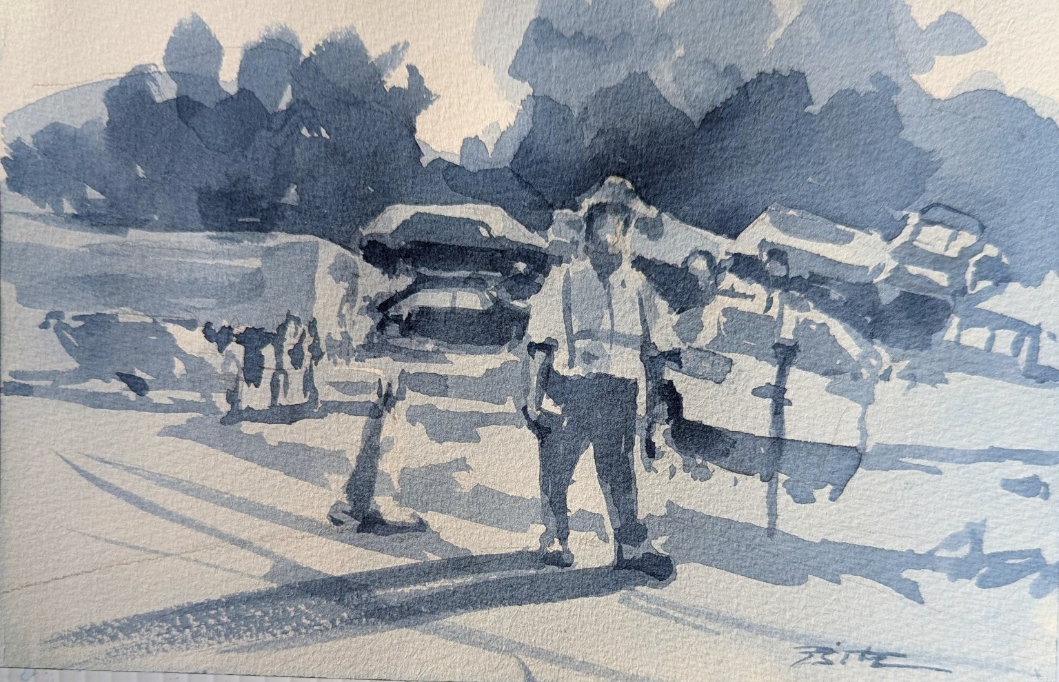
This is my original Payne’s Gray value study. The figure already reads, the light is strong, and the cast shadows give the scene life. One focused change would make the design clearer: connect and strengthen the dark shapes directly behind the figure.

My original Payne’s Gray value study of a standing figure among parked cars in strong sunlight
01My original value study

What already works

The light, figure, and shadows are already telling the story.

The standing figure is easy to find, the broad sunlit car shapes give the scene structure, and the long cast shadows create direction. I do not need to start over. I only need to strengthen the value design around the focal point.
My original Payne’s Gray value study with five numbered teaching markers placed over it
  1. 1

    Connect and strengthen the dark directly behind the figure.

  2. 2

    Simplify the cars into larger value shapes.

  3. 3

    Keep this broad, sunlit car shape simple.

  4. 4

    Add only a few dark accents that clarify the figure.

  5. 5

    Keep the cast shadows, but calm and simplify their edges.

02My original study with teaching notes

One clear improvement

A stronger dark behind the figure makes the light side pop.

The numbered markers sit over my original painting and match the clean notes underneath. The main change is not more detail. It is one larger, calmer, connected dark mass behind the figure.

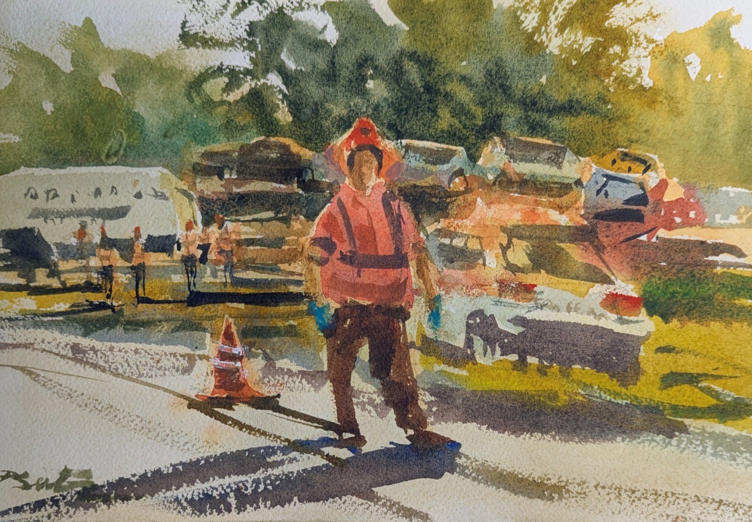
My approximately 9 by 6 inch color watercolor study of a worker standing among parked vehicles in strong sunlight
03My separate color study · approximately 9 × 6 inches

Painting two

The value study became my road map for color.

This is a separate painting on a new sheet—not color added to the Payne’s Gray study. I used the same large light, middle, and dark families, then let the warm jacket, green foliage, vehicles, and sunlit ground live inside that structure.

Free speed-painting preview

Watch the color study come together.

This 63-second video is intentionally sped up. It gives you a quick look at the painting process while the separate Payne’s Gray study remains nearby as my value road map.

Three separate teaching pieces

1. Payne’s Gray value study

2. Approximately 9 × 6-inch color painting on a new sheet

3. Sped-up video showing the color painting in progress

A slower, fully explained version may be offered as a paid lesson in the future.

My worker color study · sped-up process preview · 1:03

Focal contrast

I strengthen the area around the subject—not every part of the painting.

My reminder

“Be bolder with the darks behind the figure, then stop sooner.”

A focal point does not need a collection of tiny marks. It needs a clear value relationship. The light figure becomes easier to read when the background behind it is darker and more connected.

What I would adjust

Five purposeful changes—and no fussing.

01

Connect the dark shapes behind the figure

A single, stronger dark mass gives the light side of the figure something clear to push against.

02

Simplify the cars into larger value shapes

I do not need to describe every window, wheel, and bumper. A few accents are enough to say ‘cars.’

03

Keep the good light car shape

That broad light shape on the right gives the scene breathing room and keeps the dark background from becoming heavy.

04

Strengthen only the accents that help the figure

A few darker notes at the head, arm, clothing, and feet clarify the pose without filling the figure with detail.

05

Keep the cast shadows, but calm their edges

The long shadows explain the sunlight and lead the eye. Simpler edges make them feel connected instead of choppy.

The big lesson

Describe the scene with value shapes—not separate objects.

When I think “car, person, tree, shadow,” I can become trapped in details. When I think “light, middle, dark,” I can connect shapes across objects and make the whole painting read from a distance.

“The background has one job: help the figure read. Once it does that, I leave it alone.”

Your turn

Improve one value study without repainting everything.

Choose a small three-value study you have already made. Work on a copy or place tracing paper over it first so you can explore the design without changing your original.

  1. Step 1
    Circle the focal point

    Decide exactly where you want the viewer to look first.

  2. Step 2
    Check the value behind it

    Ask whether the backdrop creates enough contrast for the subject to read.

  3. Step 3
    Connect scattered darks

    Join nearby dark patches into one calmer shape and remove little holes that do not help.

  4. Step 4
    Simplify the supporting objects

    Reduce cars, buildings, and foliage to a few broad light, middle, and dark shapes.

  5. Step 5
    Add a few accents—and stop

    Strengthen only what clarifies the focal subject. Step back as soon as the scene reads.

Keep it simple

Connect the dark.
Clarify the figure.
Stop while it is strong.

Return to the guide library